Tabular Editor and Calculation Groups
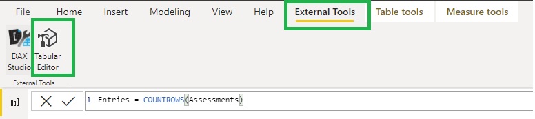
Tabular Editor(TE) is a plugin for Power BI desktop (download it here). After you run the install you should see it on the External Tools ribbon. It lets you manage/create measures more efficiency whether as a straightforward editor, or via calculation groups. Calculation groups let you transform measures in a standard way so they're useful for comparing different time periods without having to create lots of duplicate measures.
Tabular Editor as a measure editor
If you need to create or edit a quantity of measures – especially in a big model – don’t even think about doing it in Power BI desktop as you’ll lose all the dead time while BI processes the changes. Instead, open TE, open tables in the folder tree and click on the measures to edit them there. (use alt + 1 to add a new measure)
The measure editor window has find and replace and a formatter. However, it doesn’t highlight errors as you type or apply missing close brackets like BI desktop so make sure you type carefully. When you’ve edited everything you click save in TE to apply the changes back to BI (and here it will flag up any measures with incorrect syntax).
Calculation Groups
The other cool thing you can do with TE is create Calculation Groups (CG). I’ll go through two use cases here (there are more), using CG in a matrix to apply a transform to various measures and using CG in a slicer to change the measure in a visual.
Transform Measures in a matrix
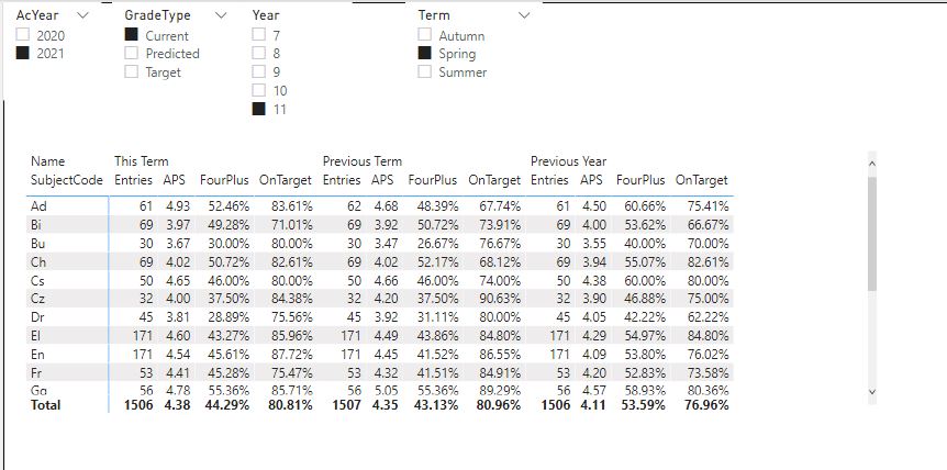
To illustrate this I’ve got some assessment data where each assessment is identified by GradeType, SubjectCode, Year and Term and four simple measures showing the number of entries, the average points score (APS), the percentage grade 4 and above and the percentage on target. Here’s a simple table showing these measures for a selected year and term.
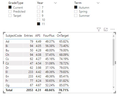
What the calculation group lets us do is display in the same visual the same values for the previous term and previous year, without creating new measures for each measure/time period combo.
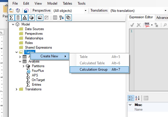
To do this open Tabular Editor, right click tables, select new Calculation group. (This will appear like a new table in your model when you save changes to BI). Give it a name then right click to create new calculation items. We’ll create three: This Term, Previous Term and Previous Year and write their code in the Expression editor.
You write calculation items just like measures using the DAX expression SELECTEDMEASURE() to stand in for whichever measure is being transformed. So this term is just SELECTEDMEASURE() as all we want it to do is reproduce the chosen measures with no transforms. The other two calculation items are:
Previous Term =
VAR Yr = SELECTEDVALUE(Assessments[Year])
VAR Term = SELECTEDVALUE(Assessments[Term])
VAR AY = SELECTEDVALUE(Assessments[AcYear])
VAR LastYear = SWITCH(Yr,
7,"X",
8,7,
9,8,
10,9,
11,10)
//Note that my years are numbers hence not in quote marks but if yours are text they need them
VAR NewYr = IF(Term = "Autumn",LastYear,Yr)
VAR NewAY = IF(Term = "Autumn",AY-1,AY)
VAR NewTerm = SWITCH(Term,
"Autumn","Summer",
"Spring","Autumn",
"Summer","Spring")
RETURN
CALCULATE(SELECTEDMEASURE(),
Assessments[AcYear]=NewAY,
Assessments[Year] = NewYr,
Assessments[Term] = NewTerm)
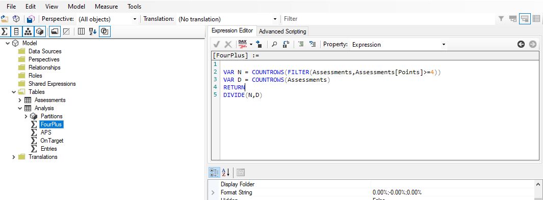
Previous Year =
VAR Yr = SELECTEDVALUE(Assessments[Year])
VAR AY = SELECTEDVALUE(Assessments[AcYear])
VAR LY = AY - 1
VAR NewYr = SWITCH(Yr,
7,"X",
8,7,
9,8,
10,9,
11,10)
RETURN
CALCULATE(SELECTEDMEASURE(),
Assessments[AcYear] = LY,
Assessments[Year] = NewYr)
Save the changes to the model in TE (often BI prompts you to refresh CGs as well). Now your calculation group will have a field called Name – add that as the column of a matrix with the measures as its values and it will perform the transform on each one.
Calculation Group in a slicer to change measure
The other main use for Calculation Groups is to have a slicer which changes the measure being shown in a visual. It’s usually preferable to use CGs for this rather than a measure using a disconnected table and SWITCH because the calculation group option lets you specify a format so you can switch between decimals/integers and percentages and have them each display correctly.
The behaviour of this method is different (and slightly counter intuitive) in that by default selecting a calculation item in a slicer replaces every measure on the page with that calculation item. You can deal with that by editing the interactions of the slicer but it’s far better to do it in the code so that you don’t have to keep readjusting if you add new visuals.
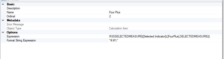
The way I suggest to do this is first create a dummy measure called Selected Indicator which is what you’ll use in the visuals you want to be affected by the CG (it must have a numerical value so I use Selected Indicator = 0).
Then in the Calculation item code we can use the DAX expression ISSELECTEDMEASURE to create a logical path that will only affect the measure [Selected Indicator]. E.g.
APS = IF(ISSELECTEDMEASURE([Selected Indicator]),[APS],SELECTEDMEASURE())
This will replace [Selected Indicator] with the measure APS but leave anything else as it is. In addition to this we need to determine the format string, which you do below the expression. Format strings need to be enclosed in quote marks and use # to denote figures (so “#.#” is numeric to 1dp) and “#.#%” is that but percentage.