Intermediate Course
Demo and Resources
In this course you can download a sample Power BI Dashboard file to play with and learn the functionality of Power BI beyond populating simple dashboards. Review the published web version of the file below, then select a lesson for a walk through of its technique.
Connect to your data
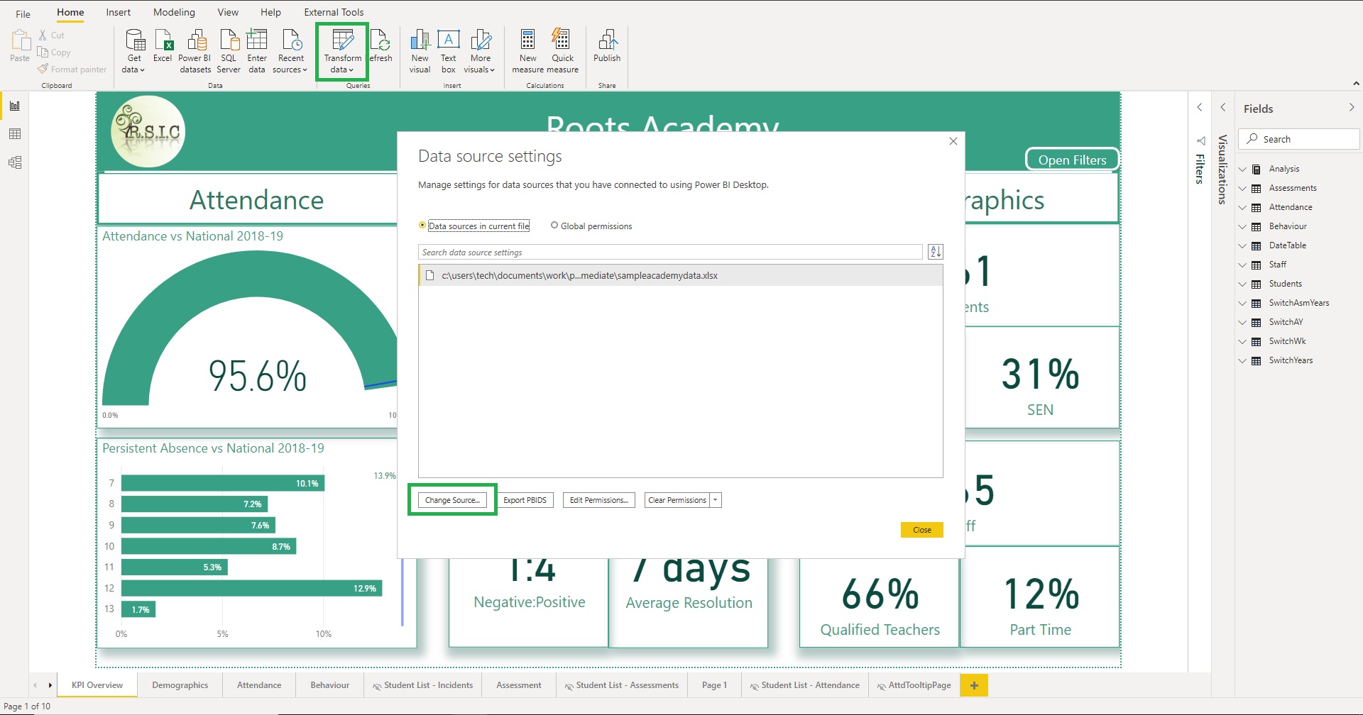
The data source for this file is an excel file called Sample Academy Data. If you want to replace the data with your own you should first export and paste over your data, without changing the existing column headings (if you can't get data for a column leave it blank but don't delete the header). It's fine to add extra columns as long as you leave the existing ones alone.
Once you have the file saved with your data in click the down arrow by Transform Data on the home ribbon and open Data Source Settings. Select change source and browse to the path of your replacement Excel file. BI should prompt you to apply the query changes, but if not, hit refresh.
If you compare the data sources in Excel with the model in Power BI desktop you'll notice that there are more tables in the latter. At the top is the Analysis table which contains all the measures. This was created via Enter Data with a single empty column. Hiding that column meant BI (after close and reopen) displays it as a measure table. The measures are subdivided into folders using the Display Folder property on the Model view.
There are also a number of tables written in DAX created via Modelling| New Table, whose icons are shaded slightly darker. I use Switch as a prefix for tables that are used for slicers and custom sorts which is covered in more detail in lesson 5. There is also a DateTable created using the CALENDAR function. Having a single date table with a row per day filter date sensitive data (in this cases attendances and behaviour events) is best practice as it makes filtering easier. If you create your own you should 'Mark as a DateTable' on the table ribbon. This changes the way CALCULATE treats filters on the table to make time intelligence DAX functions work better.
You should be able to carry on fine with the dummy data if you just want to play with the dashboard and find out how it works. Bear in mind that the date table uses the TODAY() DAX function for the end of the date range and so will eventually 'leave behind' the date range of the actual attendance records which are static. In order to get these working again the quickest hack is to download and connect the Excel file, open it and work out how many days (roughly) it will take to bring the data up to the present. Copy that number and use paste special to add it to the dates in the date column of the attendance sheet.
Know your model
Before examining any of the data or visuals I recommend you spend a couple of minutes looking at the Model view to understand how the tables are related. The 'All Tables' view is a little overwhelming so there are paginated views which show subsets of the tables.
Tooltip Pages and Cross filtering
Tooltips are pop up windows that appear when you hover over table rows, data points or chart bars. Some visuals have a tooltip field bin where you can add multiple measures to appear in the default black tooltip alongside the value measure.
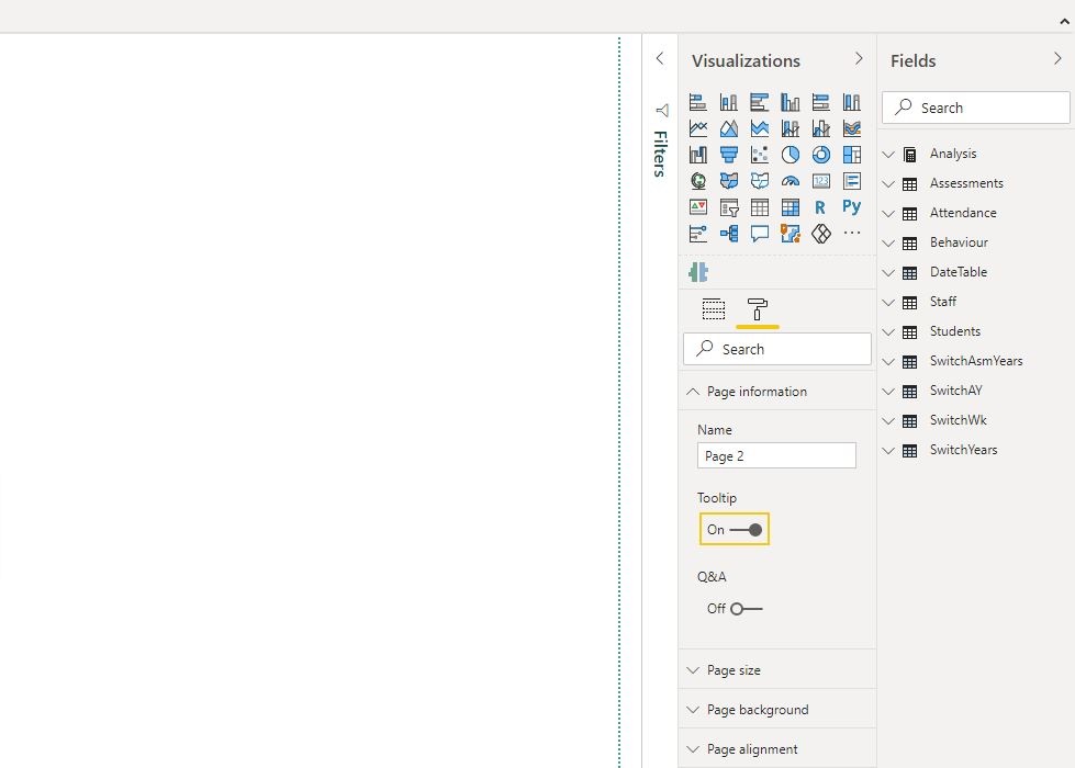
Instead of the black box though you can create tooltip pages with visuals on them. To do this create a new page and before adding any visuals go to the page formating menu on the visualization pane and under 'Page Information' check 'Tooltip'. Then adjust the page size - I think the tooltip size is usually about right but you can create a custom page that's larger or smaller. Add the visuals you want and format them then right click the page name and rename and hide it. Finally, under the formating menu of the visuals you want to display the tooltip, there is a Tooltip menu where you can select your tooltip page.
One of the really cool things BI does is cross filtering and highlighting - where you click a bar or data point and the rest of the visuals adjust to that extra filter. By default some visuals cross filter - ie they behave as if the clicked item has been chosen in a slicer, some cross highlight - ie they show the filtered item in strong colours with the value for all items greyed out behind, and some don't interact all. You can alter this behaviour by clicking on a visual, opening the Format Ribbon and turning on 'Edit Interactions'. That causes every other visual to display two or three icons at the top right for each possible interaction with the selected visual.
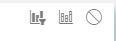
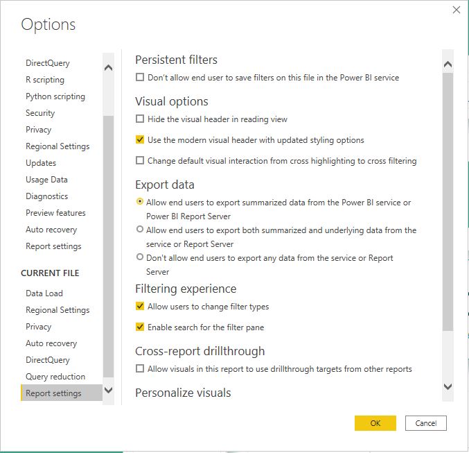
From left to right these are Cross Filter, Cross highlight and No interaction, where the latter can be used to stop visuals (usually slicers) from filtering certain visuals. Remember that the option you choose on the target visual is specific to the visual that's selected. So if you have a bank of slicers and you don't want any of them to affect a card you need to select each slicer in turn and turn off filtering on the card for every one. Note that by default date slicers don't filter each other so if you have an academic year selector and a date range slicer for dates within the year, you need to edit the interactions to make the year slicer filter the date selection. The default behaviour for most charts is cross highlighting but you can change that to cross filtering for the whole file via File| Options and Settings| Report Settings.
Custom Sort Orders and slicer switches
The default sort in a BI visual is usually the value in descending order. You can adjust this by clicking on the three dots in the top right of the visual and toggling which field to sort on and which direction. But what about times when you want to sort by something other than numerical size or alphabetical order? If you have another field on the same table as the one you want to sort with the order on it then you can use that. For example, my Date Table has the following calculated columns:
                  Weekday = FORMAT(DateTable[Date],"DDD")

                ....

                  WeekDayID = WEEKDAY(DateTable[Date],2)
The Weekday column gives the label I want ('Mon','Tue' etc). The WeekDayID column returns a number for the order of the weekday (the 2 is a styling choice which sets Monday as 1). I can select the weekday column in the field list and use Sort by column in the Column Tools record to sort the field by WeekDayID.
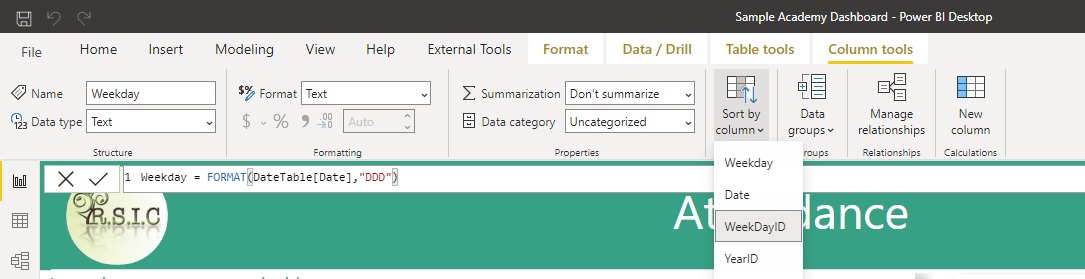
This works because the WeekDayID column is not derived from the column it's being used to sort. If you create a column with a formula like 'SWITCH(Table[Columnx],"Pears",1,"Apples",2..etc) then you can't use that to sort Table[Columnx].
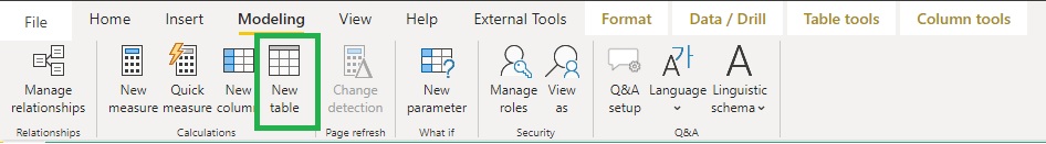
Instead, what you can do when you have a set of values you want to give a custom sort order is create a separate table with the unique values of the column to be sorted and their order, using the DATATABLE function. To do this click on 'New Table' in the modeling tab
The syntax of DATATABLE is to define column names and types followed by the data rows enclosed in curly brackets. Note you need values for each column in every row. I use the prefix 'switch' for every table I make for this purpose so they're listed together in my models. Here's an example of year groups for EYFS - KS5
                      SwitchYears = DATATABLE("Year",STRING,"Sort",INTEGER,
                                                                          {{"N",-1},
                                                                            {"R",0},
                                                                            {"1",1},
                                                                            {"2",2},
                                                                            {"3",3},
                                                                            {"4",4},
                                                                            {"5",5},
                                                                            {"6",6},
                                                                            {"7",7},
                                                                            {"8",8},
                                                                            {"9",9},
                                                                            {"10",10},
                                                                            {"11",11},
                                                                            {"12",12},
                                                                            {"13",13}
                                                                          })
Once the table is created, use sort by column to sort SwitchYears[Year] by SwitchYears[Sort] then make a relationship between the Year column and the year group on your student table. You can then use SwitchYears[Year] in visuals to filter Student[Year] and it will sort correctly.
Disconnected tables as measure switches
Another use for DATATABLE is to created unconnected tables that can act as switches in slicers. Say you create the following table
                      SwitchThreshold = DATATABLE("Label",STRING,"Value",INTEGER,
                                                                          {{"Grade 4+",4},
                                                                            {"Grade 5+",5}})
If you add a slicer with the field SwitchThreshold[Label] you can create a variable in a measure SELECTEDVALUE(SwitchThreshold[Value]) that will return 4 or 5 depending on the slicer selection. That way the user can switch a single measure to show % of pupils at grades 4 or 5 using the slicer. You can apply the same principle to selecting different measures all together, by creating a table with the measure names and ids, then creating a combined measure with code like this:
                      VariableMeasure =
                      VAR Sel = SELECTEDVALUE(Switchtable[Measureid])
                      RETURN
                      SWITCH(Sel,
                                1,[Measure1],
                                2,[Measure2],
                                3,[Measure3],
                                ....)
Drill through to student lists
Summaries and KPIs are great but as a great man once said they mean bugger all unless you know the kids behind the numbers. Luckily, BI has drill through which lets you go from summary data to detailed lists by right clicking a chart bar, table row or data point and selecting a drill through page.
The way you set this up is by adding the columns or measures that you want to drill through on to the Drill through fields bucket on the target page. Then when the measure is placed in visuals elsewhere in the report you can drill through, meaning you arrive on the target page with the filter context from the source page applied as drill through filters, which can be viewed/changed in the drill through filter bucket in PBI desktop and the filter pane on the web version.
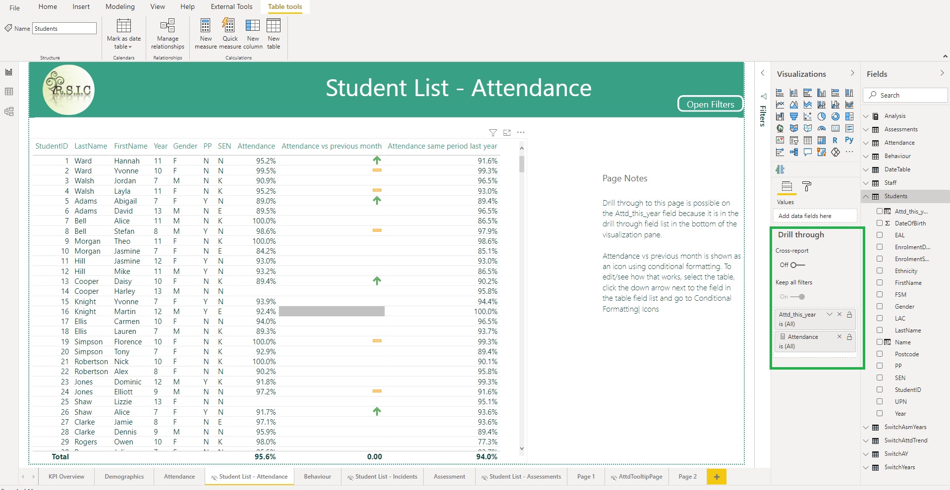
Filter Context
Filter context is the name for all the filters that are currently applied to a measure. These come from slicers on the canvas, filters in the filter pane and fields added to the visual. For example, in the screenshot below the user right clicked the bar for year 8's attendance so Student[Year]="8" is part of the filter context. For simple scenarios this will work just how you expect (you drill through the year 8 bar - you see year 8 students) so you don't need to worry about it.
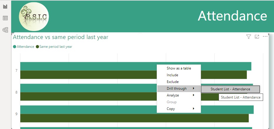
More complex drill throughs
A slightly more advanced case is dealt with for the attendance vs last month visual (below). Here a disconnected table supplies the values Improving (with TrendID =1), Static (TrendID=0) and Declining (TrendID= -1). A measure works out the number of pupils who fall into each category
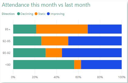
Here's the code for the measure (the attendance groups that form the axis of the chart are worked out in a calculated column on the Students table
                      Attendance Trend =
                        VAR RefDate = MAX(DateTable[Date])
                        VAR TrendDirection = SELECTEDVALUE(SwitchAttdTrend[TrendID])
                        VAR ThisMonth = DATESBETWEEN(DateTable[Date],RefDate-30,RefDate)
                        VAR LastMonth = DATESBETWEEN(DateTable[Date],RefDate-60,RefDate-31)
                        VAR AttendanceTable = FILTER(
                                                    ADDCOLUMNS(Students,
                                                                "LastMonthA",CALCULATE([Attendance],LastMonth),
                                                                "ThisMonthA",CALCULATE([Attendance],ThisMonth)),
                                                    ISNUMBER([ThisMonthA]) && ISNUMBER([LastMonthA]))

                        VAR DeclinerCount = SUMX(AttendanceTable,IF([ThisMonthA]<[LastMonthA],1))
                        VAR StaticCount = SUMX(AttendanceTable,IF([ThisMonthA]=[LastMonthA],1))
                        VAR ImproverCount = SUMX(AttendanceTable,IF([ThisMonthA]>[LastMonthA],1))
                        RETURN
                        SWITCH(TrendDirection,
                                            -1,DeclinerCount,
                                            0,StaticCount,
                                            1,ImproverCount)
Depending on whether you drill through on the Improving/Static/Declining section of the bar then SwitchAttdTrend[Direction] will be in the filter context but it's a disconnected table so it won't actually filter the table to the students who are Improving/Declining. We can do that but we need to add another measure as a filter on the table that contains the student list on the target page.
                        Attendance Trend Filter =
                        VAR TrendID = SELECTEDVALUE(SwitchAttdTrend[TrendID])
                        VAR TrendDirection = [Attendance Trend]
                        RETURN
                        IF(ISBLANK(TrendID),"Y",IF(ISBLANK(TrendDirection),"N","Y"))
The important thing to remember with this filter is that we might be drilling through from the main attendance table in which case we want to show everyone. That's what the first IF statement does because if we haven't drilled through on the trend visual, SwitchAttdTrend[TrendID] won't be filtered to one value and therefore SELECTEDVALUE will return a blank. If that's not the case then [Attendance Trend] will not be blank for the students that meet our drill through criteria.
Buttons!
Buttons are are a great and simple way to make your dashboards more interactive. There are a few types of action that can assigned to them in their formating menu but the two most common are page navigation and bookmarks. Page navigation works exactly as you'd expect - you choose Page Navigation as the action type then select the destination page.
Bookmarks are used when you want to make more detailed changes with buttons - as well as the page they can control slicer selections and which elements are hidden/visible. To define Bookmarks you go to view and show the Bookmarks pane and also the Selection pane.
Selection Pane
The selection pane lists the visuals on your page, named by their titles (so even if you don't want to display a visual title you should assign one and hide it to identify the visuals here
The eye icon next to each visual toggles whether it's visible or not. Its order on the list determines overlap order - higher items are in front of lower ones. You can multi select items in the selection pane with ctrl clicks then right click and group them which is useful if you have a set of visuals that go together (I have my filter items grouped). To create a bookmark show/hide the visuals as you want them then click 'Add' on the Bookmarks pane. Then click the bookmarks three dot menu to adjust its settings. Data refers to slicer selections so is turned off for my Open/Close filter bookmarks as I only want the bookmark to show hide the slicers, not overwrite the user's slicer selections. If you have bookmarks controlling which visuals are visible on the main canvas but also want to be able to show/hide filters then you want the visuals to reference 'selected visuals only'. For this to work you need to select all the visuals you want to be controlled *then* create the bookmark and set it to 'selected visuals only'
You can refresh what a bookmark shows by changing the report state and clicking Update on the bookmark menu. To assign it to a button, go to Action in the button's formatting pane, select Bookmark as the type and choose the bookmark