Beginner Course
Lesson 1: Get data and create a visual
Download and install Power BI Desktop. It will ask you to log in and if you don't already have one you can create a free account here.
There are lots of ways you can bring data into BI and a modern MIS like Arbor will have a live link, but the simplest way to get started is to import from a spreadsheet using the Excel button on the homescreen. Choose a spreadsheet that has all its data in columns with headings in the first row. Once you've imported it you'll see its columns or fields listed in the fields pane on the right like this:
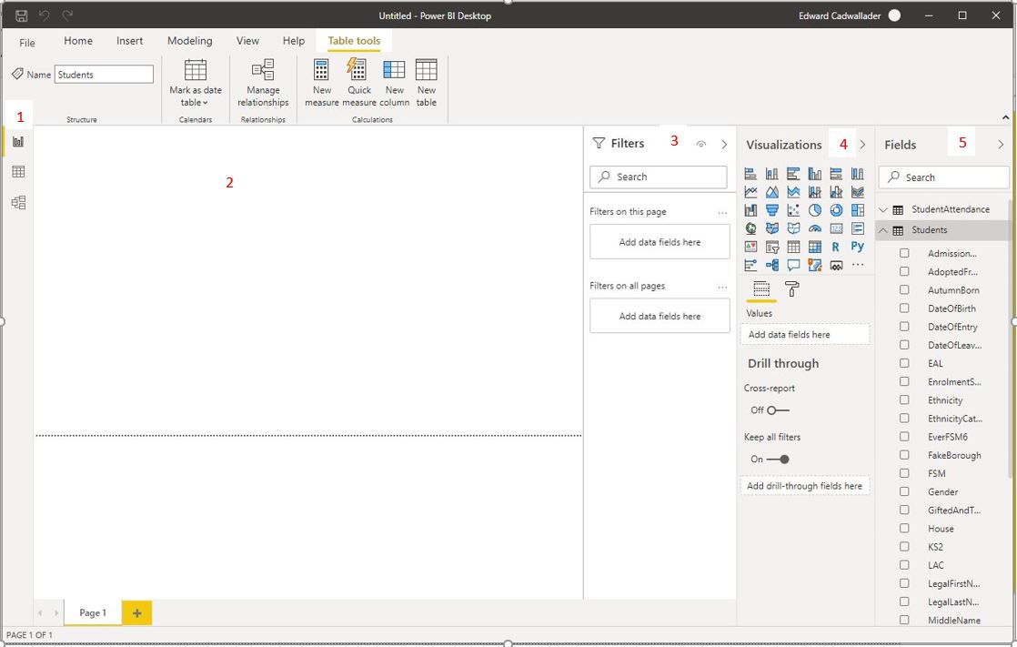
- View Selector, top to bottom: Report (the current view), Data (underlying data in table form), Model (where you create relationships between tables
- The canvas - this is where you place your visuals
- Filter Pane - you drag fields here to apply filters to the selected visual, the page or the whole report
- The visualizations pane, this is where you pick visuals for the canvas, place data fields in them and format them
- The fields list - this is where your tables and their fields are listed
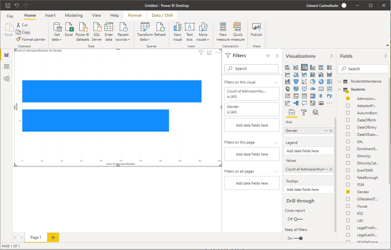
You can create a visual straight away. Select a bar chart from the visualizations pane to add a blank chart to the canvas. In the bottom half of the pane you can see its field settings 'axis', 'legend' and 'values'. Drag a descriptive field (like Gender) to the axis and then any other field that's populated for each student (like AdmissionNumber) into the values field. BI will automatically convert that into a count of the values in that field. So the visual shows a bar chart with the numbers of male and female students.
If the field you drag into the values box is text then you have the option of count and distinct count (because the value has to be a number). If your field is recognised as a number by BI it will have a sigma sign next to it and you will have the option of other aggregations like sum, average, min, max etc. There's a down arrow in the values box that lets you toggle between these.
If a field should be a number but doesn't have a sigma sign then you fix that with Power Query
Lesson 2: Extract, Transform, Load with Power Query
Power Query (PQ) is a program within a program that manages the transfer of data from your data sources to your data model in BI (also modern versions of Excel where it's on the Data tab). A common beginner mistake is to ignore it and try and solve all data issues within BI itself, but if you want additions or changes to the underlying data to make BI work better, such as classifying prior attainment as Low, Medium High or removing duplicate/erroneous records, you're much better of doing this in PQ.
You open PQ by clicking Transform Data on the home tab or selecting it when importing a new data source. It opens in a new window and looks like this:
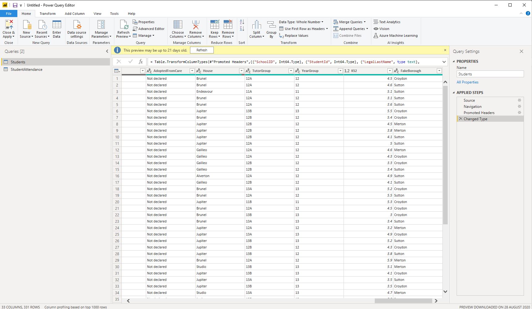
The most common task is data type changes - if you right click a column heading you can change its type, although be aware that if you change a column from text to whole or decimal number any rows that have a non numeric value in that column will cause errors. Note the applied steps view on the right, PQ is like a recipe for data, which is really useful for sources that come out of your MIS in a particular format, where you know the same changes/additions will be needed with each refresh.
Now's not the time for a comprehensive review of PQ because it has a lot of functionality, these are just a few of the useful and easy to use features
Home Ribbon
- Remove Rows - lets you strip out duplicates, blank rows or rows with errors in the selected column(s)
- Replace Values - find and replace values in selected column(s)
- Advanced Editor - don't be put off by the name, it's often useful to see the underlying code. The language is called M, syntax explained here
Add Column Ribbon
- Add Custom Column - lets you add a column with a specific value - useful if combining data from different schools
- Add Conditional Column - lets you add a nested if-then-else column
Lesson 3: Calculated Columns and Measures
- Calculated Columns - let you add fields to data tables. They use memory so avoid on big tables
- Measures - perform an operation over a table to return a single ('scalar') value so columns must be inside an aggregation like SUM, AVERAGE, MAX or MIN.
Calculated columns and measures are written in DAX (Data Analysis eXpressions). While superficially similar to the language of Excel formulas, especially for calculated columns, DAX has some pretty fundamental differences and you will get frustrated if you try to replicate exactly how you would achieve a task in Excel. Whereas Excel operates at the individual cell level, DAX operations are carried out on tables and columns.
Broadly speaking DAX functions fall into two categories, table functions return sets of data (such as results of a particular type or attendance for a certain date range) then aggregate functions summarise the data in those sets finding the SUM, AVERAGE etc. There is a special class of functions called iterators which combine these operations, taking as their first argument a table (perhaps modified by a table function) and as their second an expression. They iterate through each row of the table performing the expression for each row and then aggregating the result. These functions have the suffix X and include SUMX, COUNTX and AVERAGEX. You can find a dictionary of DAX functions and their syntax here
How to write measures
Being able to write measures using DAX is the most important skill you need in BI if you want to go beyond the very basics, but it's also hard as DAX formulas are more abstract than cell-based Excel ones. However, before you start to write a measure the first thing you should do is think about your underlying data and whether it's set up in the best way to achieve what you want. For example, let's say you have an attendance table where each row has the attendance mark (/\ABN..etc). You can use DAX to sort out which are marks are present, authorised etc but if instead you use Conditional Columns in Power Query to add 1s and 0s to two new Present and Possible columns, not only will your code be easier to write, it will compute faster too. Examples of the syntax for these two measures are given below.
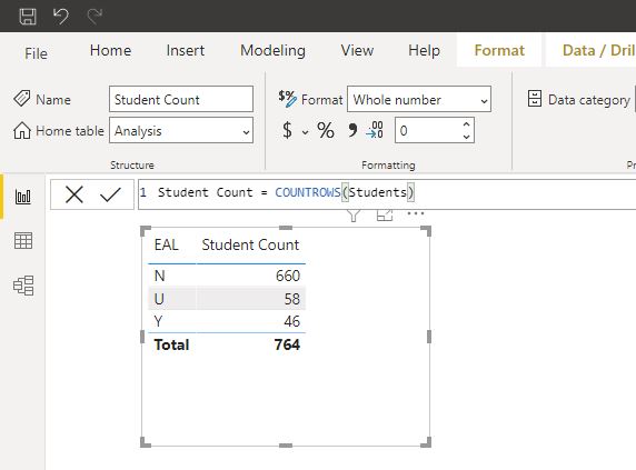
After you have your data sorted consider the filters that will be applied to the measure when it's placed on the dashboard. These come not only from filters and slicers but also tables and charts. Say you create a table and you drag the Students[EAL] field onto it. You'll get two rows with the unique values in the EAL column (Y, N and maybe U). Each row will filter the students table to rows with that value in the EAL column. So if you create a measure Student Count = COUNTROWS(Students) and put it in the table it will give a value in each row for the number of students who are EAL, who aren't and for whom you don't know. Taken together all these filters are called the filter context.
That means that measures work differently depending on where they're placed. Say you create the following measure:
EAL% = COUNTROWS(FILTER(Students,Students[EAL]="Y")) / COUNTROWS(Students)
If you put this in a card it will give you the expected result. But if you put it in the table it will tell you 100% of the EAL kids are EAL and 0% of the not EAL kids are EAL because the filter context within the table is added to that within the measure. If you want a measure to put in the table to give the percentage of students in each EAL category then you need to do something slightly more complicated - change the filter context. You can do that with the CALCULATE function which allows you to modify the filters that apply to a measure:
EAL% = COUNTROWS(Students) / CALCULATE(COUNTROWS(Students),REMOVEFILTERS(Students[EAL]))
The numerator is affected by the whole filter context, so EAL Y, N or U depending on the row of the table. The denominator has its filter context adjusted by CALCULATE to remove the filters applied by the table row so as to give the total number of students regardless of EAL status.
Keeping track of the filter context of each page and visual is essential for writing accurate measures in DAX. Another common example is on roll status - your students table will normally have past and present students so if you only want to see figures for current ones you need to apply a filter. However, rather than writing that figure into each measure it's better to apply it using a slicer or the filter pane.
Finally, remember that measures return single values so if you want to reference a column it needs to be aggregated with SUM/COUNT/AVERAGE etc. If you know it's been filtered to a single value, like a year table filtered to a single academic year for example, and you want that value you can used the SELECTEDVALUE function.
Measure Examples
                Attendance = DIVIDE(
                                  SUM(Attendance[Present]),
                                  SUM(Attendance[Possible]))
This is a measure for a dataset with 1s and 0s in Present and Possible fields on a table called Attendance. You can use arithmetic operators +-*/ but DIVIDE handles division by zero better than / as it returns a blank instead of an error
            Attendance =
            VAR P = SUMX(Attendance,IF(Attendance[MarkMeaning] in {"P","E"},1))
            VAR T = SUMX(Attendance,IF(Attendance[MarkMeaning] = "C",0,1))
            RETURN
            DIVIDE(P,T)
If attendance mark status is denoted by a letter then the code is slightly more complex. Note that the iterator SUMX is used in place of the simple SUM with embedded IF statements as there is no COUNTIF in DAX.
The code is broken down into variables to improve readibility, learn more about variables and their use in DAX here
            Teacher(s) =
            VAR Teachers = DISTINCT(Behaviour[Teachers])
            VAR TeacherCount = COUNTROWS(Teachers)
            VAR AllTeachers = CONCATENATEX(Teachers,Behaviour[Teacher],", ")
            VAR Top5Teachers = CONCATENATEX(TOPN(5,Teachers),Behaviour[Teacher],", ") & " et al"
            RETURN
            IF(TeacherCount < 6,AllTeachers,Top5Teachers)
This is a measure for a tooltip showing which teachers have given behaviour points. It checks how many are in the dataset and if more than 5 shows the first 5 then "et al"
Lesson 4: Relationships
Relationships are how we connect the data on different tables into a single model. They work by joining indetifiers ("keys") shared by different tables. For example, on the students table every kid has an id, which because it's unique on that table is called a primary key. On the Attendance table each kid has lots of attendance records which all list their student id. On this table as each id appears many times and is the primary key from a different table, it's called a foreign key
Manage relationships by switching to the model view which is the third of the view buttons on the left hand panel in Power BI desktop. On the model screen you can create relationships by dragging related fields on top of each other
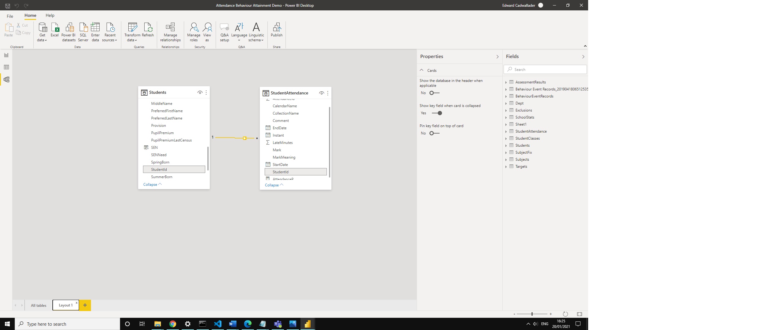
Relationships have a filter direction, which by default flows from the one to the many side of the relationship, so if you filter the students table to one student, the attendance table will be filtered to attendance records of that student. You can edit them to filter in both directions by right clicking on them and adjusting their properties. However, this can impact the speed of your model so is best avoided. It's far better to "turn on" bi directional filtering only for specific calculations if necessary by using CALCULATE and the CROSSFILTER calculate modifier. You can also make relationships inactive which means they won't have any filtering effect unless specifically called upon in an expression with CALCULATE and the USERELATIONSHIP modifier. This can be useful if you want to analyse, say, exclusions and switch between filtering the incident date to the exclusion date
When you import new table BI will autocreate relationships between fields with the same name on different tables which may or may not be what you want, so it's always best to check the state of the model after each table addition.
Lesson 5: Ribbon Tour and FAQ
The video above gives a brief tour of the functionality of Power BI Desktop, below are answers/pointers for frequently asked questions.
What does BI Cost?
Power BI desktop is free to download and you can publish dashboards you make to the web for free as well. Where you start needing to spend money is if you want to share a published dashboard to another person. For that both the sharer and receiver need a Power BI Pro licence. For education users Pro licences are currently (Jan 2021) around £20 a year so you can have a big team of users and still come in cheaper than, say, a 4Matrix, although of course you also have factor in the time and training demand of building and maintaining the BI dashboards.
Is this a report or a dashboard?
Things we build in BI - collections of data visualisations and tables are commonly called and understood to be dashboards and like everyone else I call them dashboards. Everyone that is except Microsoft who call published pbix files "Reports". When you publish your "Report" to the webservice and view it there each visual has a pin icon in the top right and you can use that to pick certain visuals and combine them in what Microsoft call a "Dashboard". So for the world a BI file is a dashboard, but in BI a "Dashboard" is a collection of visuals taken from different "Reports".
How long will it take me to learn BI?
What a question - for me the key is that within a week or two you will be able to do things that are difficult to impossible to do in Excel, so you can expect to have valuable output quickly, even if learning more complex DAX takes much longer.
How do I get data from my MIS?
SIMS: There isn't currently a direct link from SIMS to BI so the options are to export the data to CSV (manually or via Command Reporter) then import from there. To schedule refresh from csv files you'll need a Gateway, which you can download from the BI webservice. Alternatively you can use a third party integrator like Assembly or GroupCall but these obviously carry an extra cost.
Arbor: Arbor have a secure live link from their reporting module, which is great because it allows you to choose the fields/filtering you want to customise your model in BI.
Bromcom: Bromcom also have live feeds from their reporting module although in my opinion that's less useful as I find the Bromcom report writer cumbersome and bad at handling large data volumes. However, they also have an OData feed which provides a set of tables in one connection. These can't be customised but are fairly comprehensive. Both the live link and OData feeds are chargeable features that depending on your contract you may have to pay extra for.
***CONGRATULATIONS BI STAR!!***
You've now completed the beginner course and should be well on the way to creating your first dashboard. If you have a question that isn't covered, tweet me @BI4Schools